
Starbucks Planner 2013 Philippines
It’s that time of the year again when Starbucks Philippines releases their annual Starbucks Planners. Now on it’s 10th year, the Starbucks Planner 2013 set comes in 3 symbolically fiber leather cover colors representing their brand – black, white, and green. If you’d notice, it’s the 3 colors of their continually evolving logo.
This year’s theme of the limited edition Starbucks Philippines 2013 Planner is “Moments of Connection.†They chose to highlight this throughout the planner to emphasize shared moments over coffee as a form of genuine connection to uplift someone’s day.

Inside Pages: First Calendar Month – January
Here, I have also compiled 13 reasons why you should get the Starbucks 2013 Planner:
1. White & Green Covers
Apple aficionados and La Sallites would rave about this, no doubt. The white one will surely complement my white iPad and imaginary white iPhone. The Starbucks La Salle branch along Taft Avenue would surely always run out of the green one.
Although I found the blackl one generic, it’s for the ‘classic‘ lovers who want to keep it low, plain, and simple. The white and green ones just stand out, they are for the creative-types who doesn’t mind the extra attention…like me. LOL

Starbucks Planner 2013: Green, White, Black
2. Textured Pattern Cover
Front-facing, the jagged-polygons / star-like pattern on the cover start from the left fading to right which lends a textured feel while not leaving the impression of being overly designed nor too plain, externally. Two thumbs up for this.

Textured Planner Cover
3. Environment-Friendly & Inside Cover Flow Design
The external pattern was intrinsically reiterated on the first page upon opening. It reminds us of the environment-conscious efforts of Starbucks traditional in their planners every year. The same goes for this year’s planners which are 70% made of recycled materials.
4. Reusable Notebook Cover (Refills maybe?)
Awesome is awesome. I never thought SBX would make a planner with a reusable cover like this. I only see plastic reusable notebook covers in standard bookstores. But Starbucks was able to consider about making this awesomely designed covers (refer to reasons #1 & #2) actually reusable.
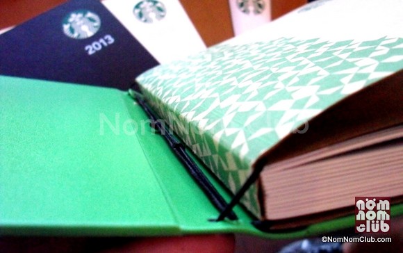
Reusable Planner Cover: Notice the attachments of the paper notebook and the cover in the photo.
I’m just not sure if this is a preemptive move in preparation for Starbucks Planners 2014. Maybe the future ones would even be more environment-friendly as refills? I don’t know, this is just a hunch. 😛
5. Charity: SparkHope
Customary as well with the journal is a charity beneficiary for the project. Every redeemed Starbucks Planner 2013 comes a donation for the children of SparkHope – an early childhood care and development program. It’s Christmas season after all and it would be great to be of help with every sip of your favorite coffee.

Charity beneficiary: SparkHope
6. Weekly and Monthly Calendars
Of course, since it’s a planner, there are calendars (lol). Weekly and monthly calendars are there for you to actually fill and somehow organize your life schedule beyond just lugging around these awesome planners.
7. “Moments of Connectionâ€
In line with their “Moments of Connection†theme, inspiring ‘connection‘ notes are placed in random dates to remind the planner aficionado to give a friend a pat at the back or to say ‘hi’ to a relative.
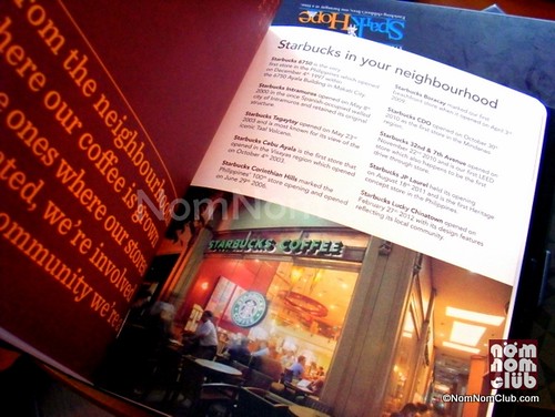
“Moments of Connection”
8. Post It notes, double adhesives & Postcards
To further enhance reason #7, built-in post-it notes and postcards are inserted in different months to share special thoughts and moments with someone you care for. It’s similar to your Facebook like and share button, only offline. 😛
Make an effort to make that someone feel extra special by giving him or her something non-digital (this reminder goes for me as well). 🙂
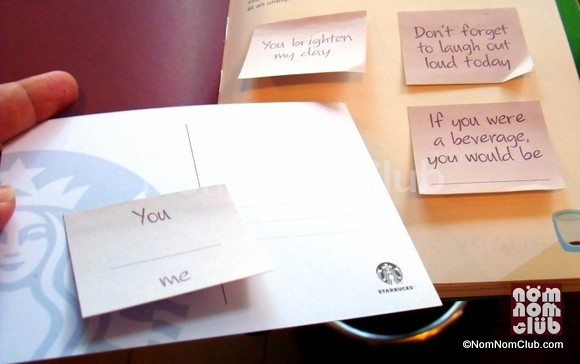
Post-Its & Postcards
9. Magnet Lock
I hate buttons for binders, they usually don’t last long and easily gives up to wear-and-tear even before the whole year is over. Solution – magnets! It makes that interesting tapping sound as well. Tap!
(See top photo)
10. Magnetic Bookmark
Remember the previous Starbucks Planner bookmarks with strings to divide the page? This year, they’re out. Magnet bookmarks are in. It’s a back-to-back hot beverage single-attached magnetic bookmark. However, since it’s basically two magnets, they tend to be too tight sometimes.
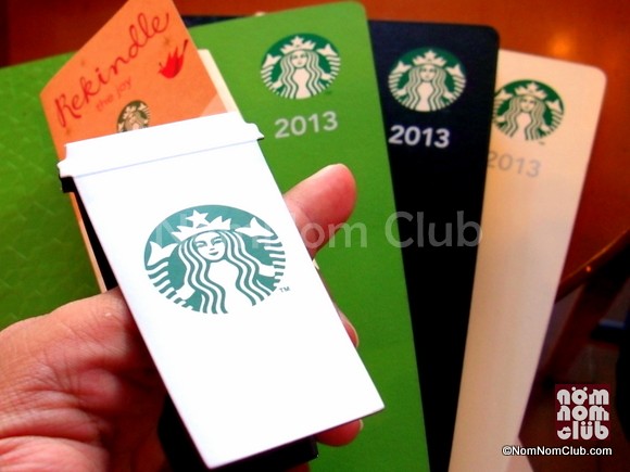
Magnetic Bookmark
If magnetic bookmarks are not your thing, you can cut it and viola, you have two Starbucks ref magnets! 🙂
11. Coupons
They’re calling them “kindness cards” this year. Call it whatever you want – freebies, discounts cards, promos, coupons!

Starbucks Planner 2013 Coupons
12. More Coupons
As they say, you can never have enough. So, you have a second page of more “kindness cards!”
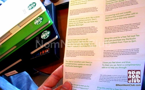
More Freebie Coupons
13. Flip Book Style
Again, awesome is awesome, the inside pages have a Starbucks cup on the lower right side which starts empty in January and fills-up through the days and pages to a fully-filled beverage by December! An instant Flip Book!
Although I thought having the reverse would be more cute depicting ‘time running out‘, mine is a pessimistic way of looking at it. This one’s better, more positive. 🙂

Flip Book Pages
So how do you already have one of the 2013 Starbucks Planners? Click here to see how to get a Starbucks Planner 2013!
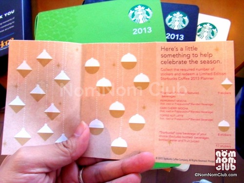
The 2013 Stamp Card which is more of a ‘paper’ than a card. 🙂

2013 Starbucks Planners